


The biggest mistake in furniture placement is neglecting traffic flow and human scale.
Failing to provide 70–90cm for movement or ignoring the 40% furniture-to-floor ratio creates “spatial friction.”
This leads to physical discomfort, restricted movement, and a psychologically cluttered environment that diminishes the room’s functional and aesthetic value.
Introduction
Creating a functional and inviting space is a delicate balance of art and mathematics.
When we ask, “What is the biggest mistake in placement of furniture?“, we are essentially asking why a room feels uncomfortable despite having beautiful pieces.
The answer lies in the “invisible architecture”—the paths we walk and the visual breathing room we require.
In both residential and commercial design, furniture should serve the human experience, not obstruct it.
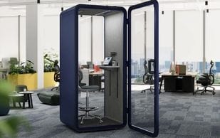
Whether you are setting up a collaborative workspace or a sanctuary for relaxation, sourcing your foundation from experts like Meet&Co ensures that your pieces are built with these ergonomic and spatial standards in mind.
This article will provide a deep dive into the science of layout, the ten most common errors, and the data-driven solutions to fix them.
Why Furniture Placement is a Scientific Discipline
The arrangement of a room is the primary factor determining its success. It is not merely about where things “look good,” but how they function as a system.
1. Spatial Utilization Efficiency
In architecture, the efficiency of a space is determined by the ratio of occupied space to circulation space.
Data from interior design audits suggest that poorly planned layouts waste up to 25-30% of usable floor area.
By applying proper placement principles, you essentially “gain” square footage without an expensive renovation.
2. The Psychology of “Flow”
Environmental psychology focuses on how surroundings affect human behavior. A “blocked” room increases cognitive load.
When you have to consciously navigate around obstacles, your brain remains in a state of low-level “micro-stress.”
Conversely, a room with an optimized “flow” promotes relaxation and social fluidity.
3. Ergonomics and Human Factors
Ergonomics is the study of people’s efficiency in their working environment.
In a professional setting, the relationship between a person and their furniture impacts long-term musculoskeletal health.
Room flow optimization ensures that essential items are within the “optimal reach zone,” reducing physical strain and increasing productivity by an estimated 12-15%.
Ten Most Common Furniture Placement Mistakes
To avoid the pitfalls of bad design, we must identify the specific errors that most people make.
1. Blocking Primary Pathways
This is the most frequent iteration of the “biggest mistake.” A room should have a clear entrance and exit path.
The Data: Architectural standards recommend a minimum of 32–36 inches (81–91cm) for primary walkways.
The Error: Placing a large sectional sofa directly in the natural walking line, forcing guests to take an indirect route.
2. Mismatched Scale and Proportion
The Mistake: Placing a massive dining table in a small breakfast nook.
The Solution: Follow the “60/40 Rule”—furniture should occupy roughly 40% of the room, leaving 60% for movement.
3. Ignoring the Focal Point
Without a focal point, the eye has nowhere to rest. Visual tracking studies show that users feel more comfortable in a room where furniture is oriented toward a single dominant feature.
4. Pushing All Furniture Against the Walls
The Fix: “Floating” furniture—pulling it even 10-15cm away from the walls—creates depth and shadows, making the room feel more intentional.
5. Obstruction of Natural Light
The Data: Obstructing windows can reduce a room’s “daylight factor” by 50%, leading to higher energy costs and decreased mood.
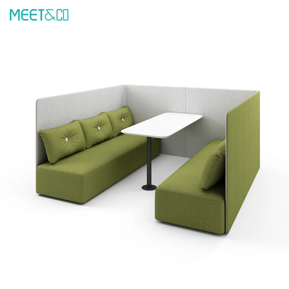
6. Ambiguous Functional Zoning
Especially in open-plan layouts, failing to define zones leads to “spatial confusion.” Use rugs or shelving to create visual boundaries.
7. Poor Lighting Placement
The Mistake: Placing a reading chair in a corner where the floor lamp’s cord becomes a tripping hazard across a main walkway.
8. Layouts that Stifle Social Interaction
The Data: Proxemics suggests the “sweet spot” for social interaction is between 4 and 8 feet (1.2 to 2.4 meters).
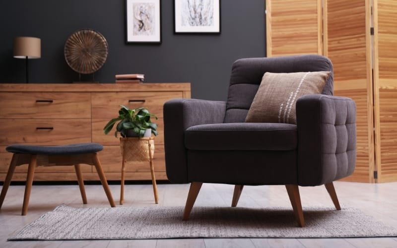
9. Neglecting Visual Balance
The Mistake: Placing all “heavy” furniture (dark woods, solid bases) on one side of the room, making the space feel physically tilted.
10. Inadequate Storage Integration
The Fix: Plan for storage at the start. Integrating a tall filing cabinet into a corner or alcove prevents paperwork from spilling onto active work surfaces.
The Science of a Perfect Layout: Formulas and Rules
To achieve a professional-grade layout, you can use mathematical ratios to guide your decisions.
1. The Space Calculation Formula
You can calculate the “Breathing Room” of your layout using this formula:
Layout Efficiency = [Total Room Area – (Furniture Area + Clearance Area)] / Total Room Area
Example Calculation for an Office:
Total Room Area = 200 sq. ft.
Furniture + Clearance (Desk, chair, and paths) = 84 sq. ft.
Efficiency Score: (200 – 84) / 200 = 0.58
An efficiency score of 0.30 to 0.45 is considered the “goldilocks zone” for a comfortable, functional room.
A score of 0.58 indicates an “Executive Grade” layout—spacious and highly efficient.
Practical Strategies for Different Environments
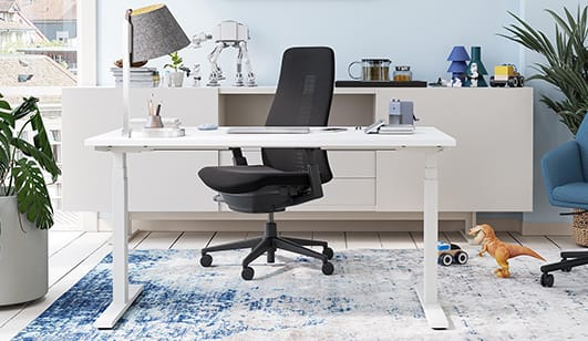
1. The Home Office: Efficiency and Authority
In an office, the placement of the desk is paramount.
The Strategy: Position your office desk in the “Power Position”—facing the door with a solid wall behind you. This reduces the “startle response” and increases focus.
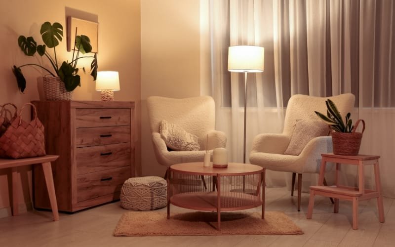
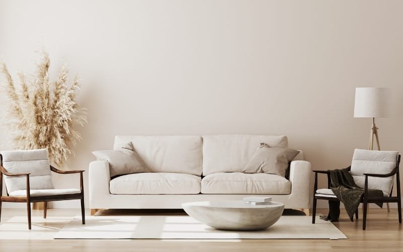
2. The Living Room: Social Convergence
The living room is for connection. Create a conversational circle where the TV is secondary to the faces of your guests.
3. Small Apartments: The Multi-Functional Shift
In small spaces, every piece must “earn its keep.” Use furniture that offers vertical storage to keep the floor clear.
Tools for Layout Optimization
Before you exert physical effort, use these professional resources:
Online Floor Plan Apps: Tools like RoomSketcher allow you to test the “flow” virtually.
Painter’s Tape: Tape the outline of your furniture on the floor to see if the 90cm clearance is actually maintainable.
Conclusion and Action Plan
Fixing the biggest mistake in furniture placement requires a shift from viewing your home as a collection of objects to viewing it as a series of paths and zones.
By prioritizing traffic flow and human scale, you ensure that your space is not just beautiful, but truly livable.
Summary Checklist:
The 90cm Rule: Ensure all primary pathways have clear clearance.
The 40% Rule: Don’t overcrowd the floor; let the room breathe.
The Power Position: Face your desks toward the entrance.
The Anchor Principle: Use rugs to ground your layout.
When you invest in high-quality items from Meet&Co Office Furniture, you are buying the potential for a perfectly balanced environment.
Take the time to measure, plan, and tape out your space.
Your back, your brain, and your guests will thank you for the extra breathing room.