







 Meet&Co
Step into a workspace painted in calming blues and greens, and you feel focused and at ease. Walk into a classroom with vibrant red or yellow accents, and you sense energy and creativity. Color isn’t just decoration—it’s a powerful tool that shapes how we think, feel, and perform.
For decades, psychologists and designers have studied how color influences human behavior. In office and school environments, where people spend hours focused, collaborating, or learning, the colors of walls, furniture, and accents can have a measurable impact on productivity, mood, and even cognitive performance.
We’ll explore the psychology of color in office and school furniture, helping you choose hues that support the activities and well-being of the people who use these spaces.
Why Color Matters in Work and Learning Environments
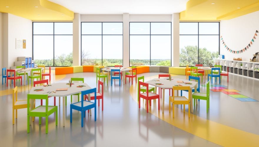
Color affects us on multiple levels: physiological, emotional, and cognitive. Certain hues can raise heart rate and stimulate alertness; others calm the nervous system and reduce stress.
| Effect | How Color Influences |
| Physiological | Color can affect blood pressure, heart rate, and even muscle tension. Red has been shown to increase arousal; blue can lower stress hormones. |
| Emotional | Colors evoke associations—warm colors feel energetic, cool colors feel serene. These associations shape mood and emotional state. |
| Cognitive | Color can influence attention, creativity, and memory. Research suggests that certain colors improve performance on specific tasks. |
In offices and schools, where the goal is often a balance of focus, creativity, and collaboration, color choice becomes a strategic decision—not just an aesthetic one.
Basic Color Psychology: Warm vs. Cool
Before diving into specific colors, it helps to understand the two broad categories.
| Color Family | Characteristics | Best For |
| Warm colors (red, orange, yellow) | Stimulating, energetic, attention-grabbing | Creative tasks, active learning, areas meant to energize |
| Cool colors (blue, green, purple) | Calming, focusing, stabilizing | Analytical work, concentration, relaxation zones |
Warm colors can increase heart rate and create a sense of urgency or excitement. Cool colors slow the pulse and promote a sense of calm—helpful for long periods of concentration.
Individual Colors and Their Effects
Red
Red is the most stimulating color. It raises energy levels, increases heart rate, and grabs attention. In furniture, red can be used to highlight active zones, collaborative spaces, or areas where quick decision-making is needed. However, too much red can create anxiety or aggression.
Best in offices: Accent chairs in break areas, collaborative pods, or as a highlight on task chairs.
Best in schools: Reading corners, makerspaces, or early childhood areas where energy is welcome. Avoid overuse in testing or quiet study zones.
Orange
Orange combines the energy of red with the cheerfulness of yellow. It encourages social interaction and creativity without the intensity of red. Orange is often associated with enthusiasm and optimism.
Best in offices: Creative studios, brainstorming rooms, casual meeting areas.
Best in schools: Art rooms, collaborative zones, elementary classrooms where playfulness is valued.
Yellow
Yellow is the color of optimism and mental clarity. It stimulates the left brain—the analytical side—and can enhance memory and problem-solving. However, bright yellow can be overwhelming in large doses and may cause eye fatigue.
Best in offices: Conference rooms, training spaces, areas for planning and strategy.
Best in schools: Classrooms for subjects requiring logical thinking (math, science), and as accent colors on storage or seating.
Blue
Blue is universally associated with calm, focus, and productivity. It lowers heart rate and promotes concentration, making it ideal for tasks requiring sustained attention. Darker blues convey professionalism; lighter blues feel airy and open.
Best in offices: Focus workstations, private offices, quiet zones.
Best in schools: Study areas, library seating, individual desks—anywhere students need to concentrate.
Green
Green is the most restful color for the eyes. It balances emotions, reduces stress, and is associated with growth and harmony. Green is versatile—it works well in both collaborative and individual settings.
Best in offices: Wellness rooms, break areas, open-plan workspaces.
Best in schools: Reading nooks, science classrooms, calming corners for emotional regulation.
Purple
Purple combines the stability of blue with the energy of red. Lighter purples (lavender) can be calming; deeper purples feel luxurious and creative. Purple is often linked to imagination and wisdom.
Best in offices: Executive offices, creative studios, meditation spaces.
Best in schools: Art rooms, libraries, special education settings where a calming but creative atmosphere is desired.
Neutrals (Gray, Beige, White)
Neutral colors provide a backdrop that lets other colors pop. They can feel modern and clean but risk being sterile if overused. Adding texture or colorful accents keeps neutral spaces inviting.
Best in offices: Base color for desks, shelving, and large furniture pieces; pair with colorful seating or accessories.
Best in schools: Cabinetry, shelving, and durable surfaces; add color through chairs, cushions, and wall art.
Color Applications for Offices
Different zones in an office benefit from different color strategies. Use this table as a guide.
| Office Zone | Recommended Colors | Why |
| Focus areas / workstations | Blue, green, soft neutrals | Promote concentration and calm |
| Collaboration zones | Orange, yellow, red accents | Energize discussion and creativity |
| Break rooms / lounges | Green, warm neutrals, soft blues | Restorative, inviting |
| Conference rooms | Blue, purple, neutral with warm accents | Balanced: focus with creativity |
| Reception / entry | Company brand colors, warm neutrals | Welcoming, professional |
| Wellness / quiet rooms | Green, lavender, soft blues | Calming, stress-reducing |
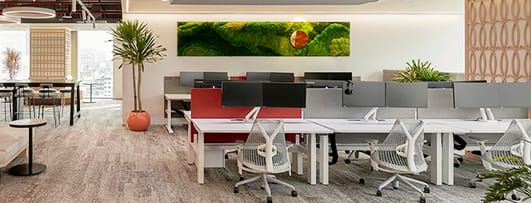
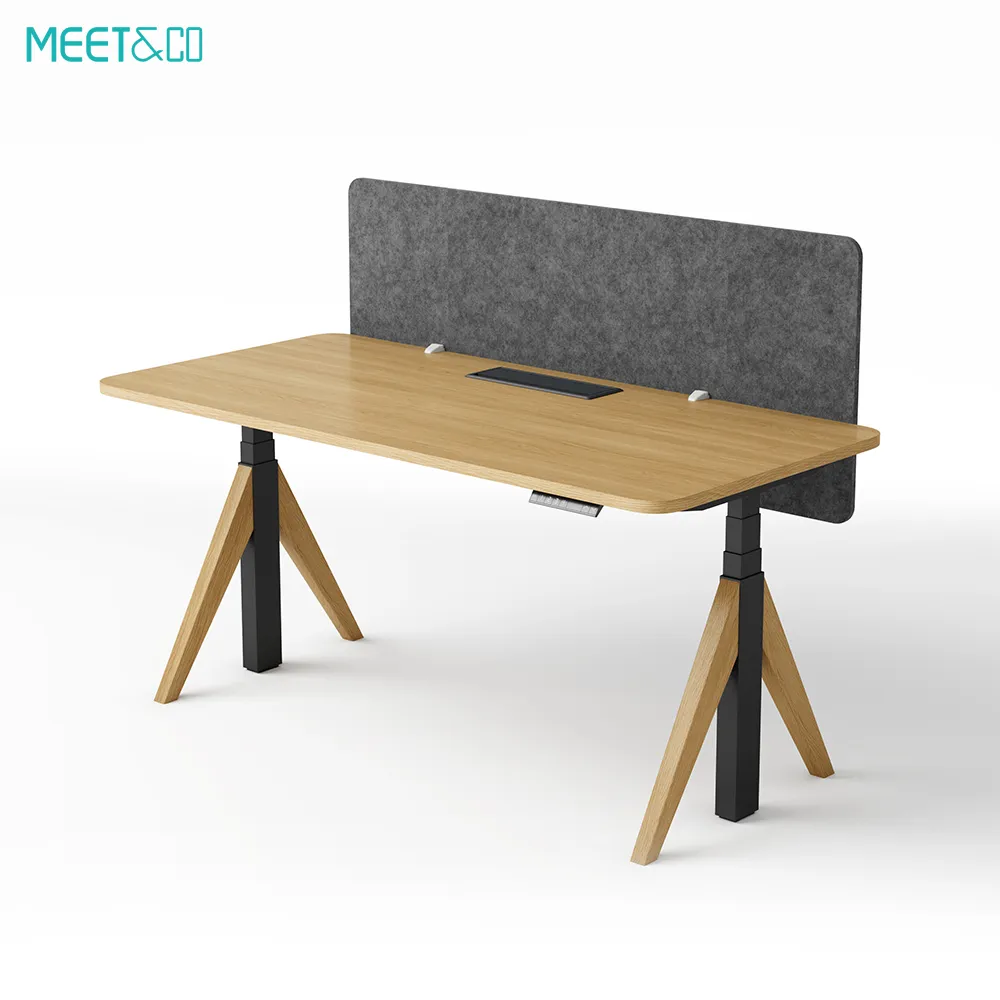
When selecting furniture, consider using color blocking: use neutral desks and shelving, and bring color in through seating, privacy screens, and accessories. This allows easy updates without replacing large pieces.
Color Applications for Schools
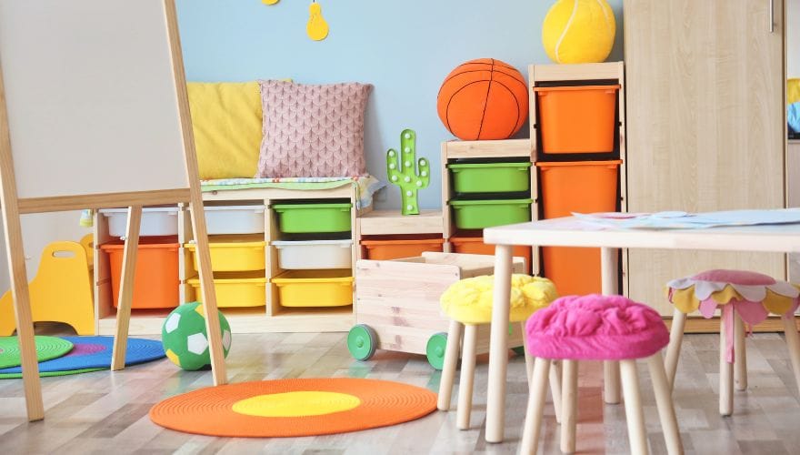
Age group matters when choosing colors for schools. Young children respond to bright, primary colors, while older students benefit from more subdued palettes that support focus.
| Age Group | Recommended Color Approach | Examples |
| Pre-K and early elementary | Bright, primary colors with warm accents | Red and yellow seating for active play; blue and green for quiet corners |
| Upper elementary | Balanced palette; cool colors for focus, warm for collaboration | Blue desks, orange collaborative tables, green reading nooks |
| Middle school | Muted versions; emphasis on calm and choice | Gray desks with blue chairs; green soft seating |
| High school | Sophisticated neutrals with pops of cool colors | Gray or wood-look tables; blue or green task chairs; colorful lounge seating |
Classroom Zones and Color
Like offices, classrooms can use color to define zones:
| Zone | Color Suggestion | Why |
| Direct instruction area | Blue, green | Focus on teacher, sustained attention |
| Collaborative tables | Orange, yellow | Energy for group work |
| Reading corner | Green, lavender, soft neutrals | Calm, comfortable |
| Makerspace / creative zone | Red, orange accents | Stimulate creativity and action |
| Calming corner | Soft blue, green | Emotional regulation |
Practical Tips for Selecting Furniture Colors
1. Start with a Neutral Base
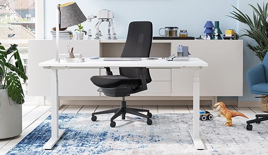
Large furniture pieces—desks, shelving, tables—are expensive to replace. Choose neutral colors (gray, beige, white, light wood) for these items. They provide flexibility and allow you to refresh the space with colorful accents over time.
2. Use Color for Wayfinding
In large offices or schools, color can help people navigate. Use consistent accent colors to identify different wings, floors, or departments. Colored seating in a common area can signal different zones.
3. Consider Cultural Associations
Colors carry different meanings in different cultures. For global organizations or diverse school populations, be mindful that red, white, and other colors may have specific cultural connotations.
4. Balance Saturation
Highly saturated, bright colors are stimulating but can cause visual fatigue if overused. Use them as accents—on chairs, cushions, or accessories—rather than on every surface. Muted or pastel versions of colors provide the same psychological benefits with less intensity.
5. Test Before Committing
Color perception varies under different lighting. Test fabric or finish samples in your actual space, under both natural and artificial light, before making large purchases.
6. Incorporate Biophilic Elements
Green is not only a calming color—it also connects us to nature. Combine green furniture with plants, natural wood, and views of the outdoors for a holistic well-being effect.
Common Mistakes to Avoid
| Mistake | Why It’s Problematic | Better Approach |
| Overusing bright colors | Visual fatigue, overstimulation | Use bright colors as accents, not main surfaces |
| Ignoring age appropriateness | Young children need stimulation; older students need calm | Match palette to developmental needs |
| Choosing colors based solely on trends | Trends fade; furniture lasts | Choose timeless neutrals for large pieces, trends for accessories |
| Forgetting about light | Colors look different under fluorescent, LED, or natural light | Test samples under actual lighting conditions |
| Using only one color | Lacks visual interest, doesn’t support varied activities | Create zones with different color strategies |
FAQ
1. Does blue really improve productivity?
Research suggests blue enhances focus and cognitive performance on analytical tasks. It’s a safe choice for workstations and study areas. However, for creative tasks, a touch of warm color (orange or yellow) can be beneficial.
2. What color is best for reducing stress?
Green and soft blue are most associated with stress reduction. Incorporate them in break areas, quiet zones, or any space meant for relaxation.
3. Can color help students with ADHD or sensory sensitivities?
Yes. Cool, muted colors (soft blue, green, gray) can be calming. Avoid highly saturated reds and oranges, which may be overstimulating. Offer students choice—some may benefit from a quiet corner with neutral tones.
4. Should all furniture in a school library be the same color?
No. A variety of colors can define zones. Use calming blues and greens for reading nooks, warm oranges or yellows for collaborative tables, and neutral shelving to ground the space.
5. How do I incorporate brand colors in an office without overdoing it?
Use brand colors as accents—on lounge chairs, acoustic panels, or small accessories. Keep large furniture pieces neutral. This maintains brand identity without overwhelming the space.
6. Is it okay to use white furniture in schools?
White surfaces can look clean but show dirt quickly. If using white, choose durable, easy-clean finishes and be prepared for frequent maintenance. Off-white or light gray is often more practical.
Conclusion
Color is one of the most powerful—and often overlooked—tools in designing productive, comfortable spaces. In offices, the right color choices can enhance focus, spark creativity, and reduce stress. In schools, color can support age-appropriate behavior, define zones, and create environments where students feel safe and engaged.
The key principles are simple:
- Use neutrals for large, permanent pieces (desks, shelving) to allow flexibility.
- Bring color in through seating, screens, and accessories that can be updated easily.
- Match color to activity: cool for focus, warm for collaboration and creativity.
- Consider the age and needs of users: bright for young children, calmer for older students and professionals.
- Test colors in your actual lighting before committing.
Thoughtful color selection doesn’t just make a space look good—it makes the people inside feel better, work better, and learn better. That’s a return on investment worth every hue.


_8.webp)

